Miami-Dade County 2024 Presidential election map
This project, created for the Miami New Times, Miami-Dade's second most circulated paper, colored each of the 700+ precincts based on a gradient of the percentage of people who voted for Trump or Harris. The map showed the unexpected voting patterns through the county which led to it flipping red for the first time in 36 years. This map was the 11th most viewed article on Miami New Times' website.
Indian families find home in historic Korean community
For Filipino Americans, the Fourth of July is layered
with pride, history and new worries
Which producer drove album streams?
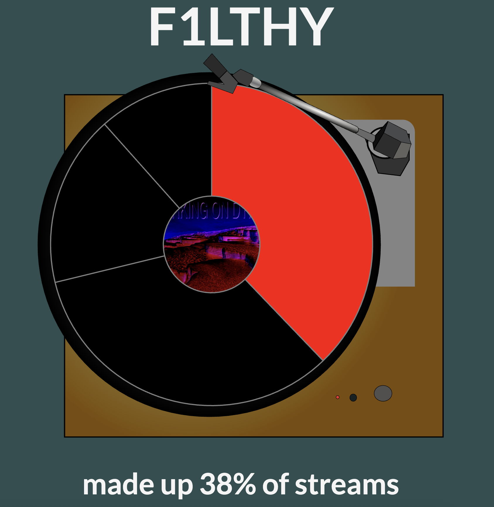
For this project, I wanted to visualize the share of streams that each producer
on a rap album accounted for. The album Whole Lotta Red primarily had three
producers (artists who make the beat of a song) that contributed to the album. How many streams
did F1lthy, one of the producers, accrue for the album? How about Oogie Mane, another of the
producers? My visualization attempts to show their share of streams using a pie chart that spins
and plays music like a record player.
To interact with this visualization, please click on the screen then scroll to spin the record
player and play a song.